![]()
Making plots#
A key aspect of exploring data is the ability to visualize it, e.g. by making plots. A key library for doing this is matplotlib. This library allows one to make and customize a variety of plot styles including basic histograms, scatter plots, bar charts, line plots and many more. Complete documentation can be found via the following links:
And of course there are many, many other tutorials on the web and in Youtube for various levels of expertise.
Here we give some basic examples that may be useful for the exercises. Explore further possibilities through the links above!
import matplotlib.pyplot as plt
import numpy as np
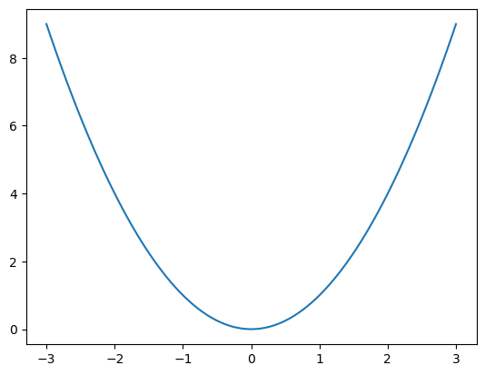
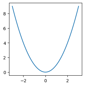
Simple Plot#
For simple line plots:
x = np.linspace(-3,3,100)
y=x**2
plt.plot(x,y);
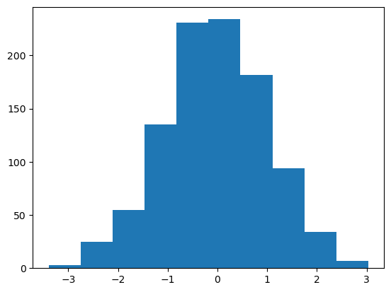
Histogram#
values = np.random.normal(size=1000)
plt.hist(values);
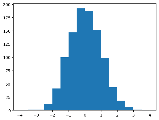
You can also specify the binning:
values = np.random.normal(size=1000)
bins = np.linspace(-4,4,17)
print(f'{bins = }')
plt.hist(values, bins=bins);
bins = array([-4. , -3.5, -3. , -2.5, -2. , -1.5, -1. , -0.5,  0. ,  0.5,  1. ,
        1.5,  2. ,  2.5,  3. ,  3.5,  4. ])
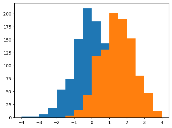
You can overlay more than one distribution:
values1 = np.random.normal(size=1000)
values2 = np.random.normal(loc=1.5, size=1000)
bins = np.linspace(-4,4,17)
plt.hist(values1, bins=bins)
plt.hist(values2, bins=bins);
Matplotlib will cycle through the following colors (in hex/rgb format):
colors = plt.rcParams["axes.prop_cycle"].by_key()["color"]
print(colors)
['#1f77b4', '#ff7f0e', '#2ca02c', '#d62728', '#9467bd', '#8c564b', '#e377c2', '#7f7f7f', '#bcbd22', '#17becf']
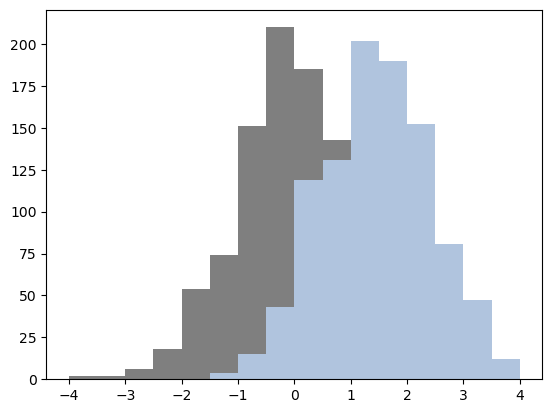
but you can also choose different colors and specify them both by name and by hex/rgb code:
plt.hist(values1, bins=bins, color='#7f7f7f')
plt.hist(values2, bins=bins, color='lightsteelblue');
Scatter plots#
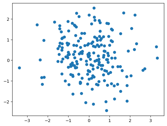
x = np.random.normal(size=200)
y = np.random.normal(size=200)
plt.scatter(x,y);
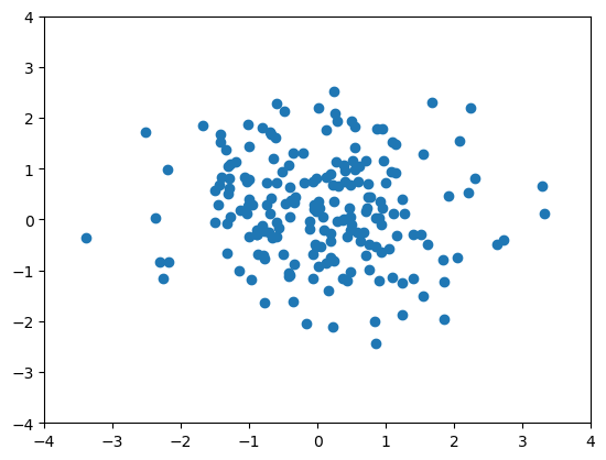
The axis limits are determined automatically based on the data. You can also specify these explicitly
plt.xlim(-4,4)
plt.ylim(-4,4)
plt.scatter(x,y);
You can also specify different colors, change marker sizes and other things:
x_bad = np.random.normal(size=200)
y_bad = np.random.normal(size=200)
x_good = np.random.normal(size=200)
y_good = np.random.normal(size=200)
plt.xlim(-4,4)
plt.ylim(-4,4)
plt.scatter(x_good,y_good, color='limegreen',s=10)
plt.scatter(x_bad,y_bad, color='red',s=15);

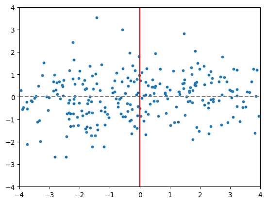
You can also add horizontal and vertical lines:
x = 8.0*np.random.random(size=250) - 4.0
y = np.random.normal(size=250)
plt.xlim(-4,4)
plt.ylim(-4,4)
plt.scatter(x,y,s=10)
plt.axhline(y=0,color='gray',linestyle='--')
plt.axvline(x=0, color='red', linestyle='-')
plt.show()
Images (2D Array Data)#
In matplotlib, 2 dimensional (2D) data can be visualized using the ``imshow()’’ plotting option. Here the 2D data is organized as a 2D array of values. For example:
board = np.arange(0,64).reshape(8,8)
print(board)
[[ 0  1  2  3  4  5  6  7]
 [ 8  9 10 11 12 13 14 15]
 [16 17 18 19 20 21 22 23]
 [24 25 26 27 28 29 30 31]
 [32 33 34 35 36 37 38 39]
 [40 41 42 43 44 45 46 47]
 [48 49 50 51 52 53 54 55]
 [56 57 58 59 60 61 62 63]]
plt.imshow(board)
plt.colorbar()
plt.show()
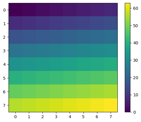
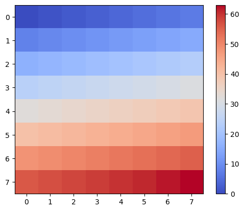
What imshow() has done is to take the full range of values from the array and map them to a “colormap”. A colormap is a range of colors, here from dark blue to yellow, with mixes like greens in the middle. The default colormap (if we do not tell imshow() otherwise) is called “viridis”. You can choose other colormaps and specify them like this:
plt.imshow(board, cmap='coolwarm')
plt.colorbar()
plt.show()
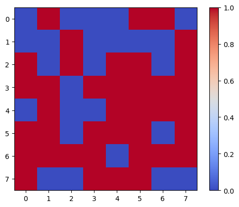
board = np.random.randint(0,2,64).reshape(8,8) # here randint generates 64 random ints in the range [0,2)
plt.imshow(board, cmap='coolwarm')
plt.colorbar()
plt.show()
Bar Plots#
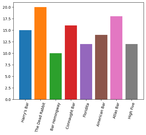
Bar plots are also possible, with non-numeric labels. Here we demonstrate also passing a list of colors for the different bars and rotation of the x tick labels.
bars = ["Harry's Bar", "The Dead Rabbit", "Bar Hemingway", "Connaught Bar", "Floridita",
        "American Bar", "Atlas Bar", "High Five"
]
barstools = [15, 20, 10, 16, 12, 14, 18, 12]
plt.xticks(rotation=75) # Since the names are long we rotate them 75 degrees
colors = ['#1f77b4', '#ff7f0e', '#2ca02c', '#d62728',  '#9467bd', '#8c564b',
          '#e377c2', '#7f7f7f',  '#bcbd22', '#17becf'] # more than needed
plt.bar(bars,barstools,color=colors);
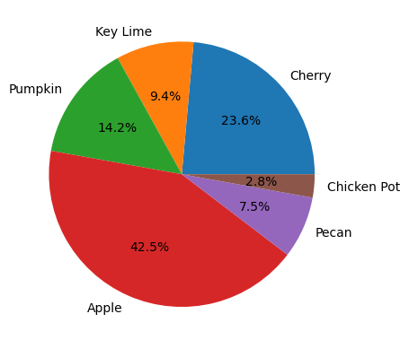
Pie Charts#
While less commonly used in Physics, sometimes it is useful to use a pie chart.
# Number of pies sold
labels = ['Cherry','Key Lime','Pumpkin','Apple','Pecan','Chicken Pot']
numbers = [25, 10, 15, 45, 8, 3]
plt.pie(numbers, labels=labels,autopct='%1.1f%%'); # autopct adds percentages
Customizing Labels, Styles, Subplots, Axes#
A number of customizations are available for your plots.
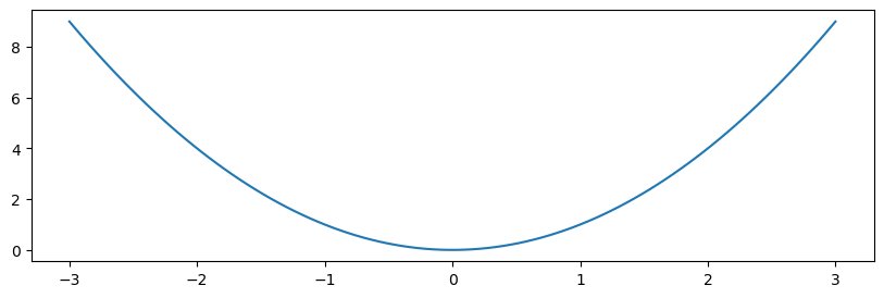
You can change the overall size and shape of the image file (units are nominally in “inches”):
plt.figure(figsize=(3,3)) # A square image
x = np.linspace(-3,3,100)
y=x**2
plt.plot(x,y);
plt.show();
plt.figure(figsize=(10,3)) # Make it wider for the same height
x = np.linspace(-3,3,100)
y=x**2
plt.plot(x,y);
plt.show();
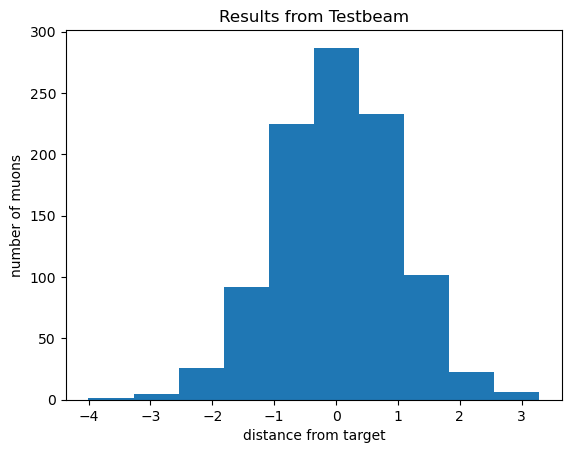
You can add a overall title and label the axes:
values = np.random.normal(size=1000)
plt.title('Results from Testbeam')
plt.xlabel('distance from target')
plt.ylabel('number of muons')
plt.hist(values);
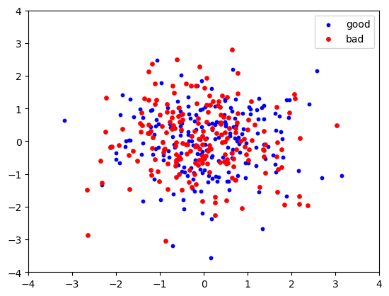
And you can add a legend using plt.legend(), but you will also need to add the label keyword to the actual plotting function calls:
x_bad = np.random.normal(size=200)
y_bad = np.random.normal(size=200)
x_good = np.random.normal(size=200)
y_good = np.random.normal(size=200)
plt.xlim(-4,4)
plt.ylim(-4,4)
plt.scatter(x_good,y_good, color='blue',s=10, label='good')  # note that we add a label keyword
plt.scatter(x_bad,y_bad, color='red',s=15, label='bad')
plt.legend();
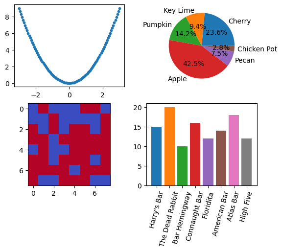
Subplots#
It is also possible to make grid-like arrays of plots using the subplots() function.
Here we make a 2x2 array of some of the previous plot examples above.
fig, axs = plt.subplots(2,2)
# reusing data defined for the plots above
axs[0,0].scatter(x,y,s=10)
axs[0,1].pie(numbers, labels=labels,autopct='%1.1f%%')
axs[1,0].imshow(board, cmap='coolwarm')
axs[1,1].tick_params(axis='x', rotation=75)
axs[1,1].bar(bars,barstools,color=colors);
Style Customization for High Energy Physics#
The mplhep package provides functionality to customize plots to the styles used by the LHC experiments and ROOT. See the documentation for more information.